Have you ever been asked to create a histogram, and then later requested to make a bar graph, and wondered what the difference was? If so, you’re not alone! In this blog post, we’ll explain the differences between histograms and bar graphs, as well as when it’s appropriate to use each type. Stay tuned!
What is a Histogram?

A histogram is an important statistical tool that displays data using bars of different heights. The height of each bar represents the number of data points that fall within a certain range, and the width of the bars can be adjusted to show more or less detail.
Histograms are used to visualize things like frequency distributions and overall trends in data sets. They can be particularly helpful for identifying outliers or data points that fall outside of the general pattern.
While histograms can be created by hand, they are usually generated using statistical software. This makes it easy to adjust the parameters and create an accurate representation of the data.
How to Make a Histogram

To make a histogram, you will need a set of data, a graphing tool, and knowledge of how to use the tool. Once you have those things, follow these steps:
- Decide on the ranges for your bins. This will depend on the specifics of your data set.
- Create your bins. Most graphing tools will have an option for creating bins automatically.
- Enter your data into the bins. Remember to assign each data point to only one bin.
- Adjust the widths of the bins if needed. Again, this will depend on the specifics of your data set.
- Label your axes and give your histogram a title.
- Check your work for accuracy.
What is a Bar Graph?

Bar graphs are one of the most commonly used types of data visualizations. They are used to compare data points along a common scale, and they can be used to track changes over time. Bar graphs can be horizontal or vertical, and they can be organized by groups or categories. One of the benefits of using bar graphs is that they can be easily understood, even by those who are not familiar with data visualization.
Another benefit is that bar graphs can be customized to highlight specific data points or comparisons. For example, bars can be color-coded to represent different categories, and data labels can be added to show exact values. When used effectively, bar graphs can be a powerful tool for conveying information.
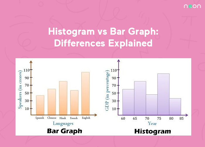
Differences between Histogram and Bar Graph
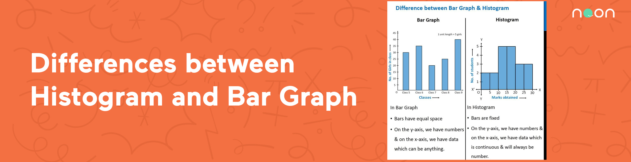
A histogram is a graphical representation of data that shows how many times each value occurs. It is similar to a bar graph, but the bars represent ranges of values instead of individual values. Histograms are used to show the distribution of data, and they can help identify outliers and patterns.
Bar graphs, on the other hand, are used to compare data between different groups. Each bar represents a category, and the height of the bar shows how much data falls into that category. For example, a bar graph could be used to compare the heights of different trees in a forest. Histograms and bar graphs are both useful tools for visualizing data, but they serve different purposes.
Conclusion
Histograms are a great way to show the distribution of data, and they can help you identify outliers and patterns. Bar graphs, on the other hand, are perfect for comparing data between different groups. If you want to learn more about how to ace your next exam, use the Noon app. It has over 10,000 lectures from some of the best teachers in the world on all sorts of subjects. With so many resources at your disposal, there’s no reason not to download it today!